PRTOTYPE.COM · Production studioAudit · Build · Maintain
PRoTOTYPE.COM
Location Impact Explorer
Case study · Static demonstrator

Open data, pointed at decisions.

The Location Impact Explorer is a geospatial decision-support demonstrator for clean-cooking programmes: a build-time pipeline turns open population rasters into H3 hexagons over Senegal, Mali and Cambodia, tiers every cell on UN DEGURBA-aligned thresholds, and renders map, dashboard and registry from data the browser computes on load — all of it synthetic, and labelled so on every screen.

Type
Geospatial decision support
Data
GHSL · Kontur · WorldPop
Status
Demonstrator · synthetic data
3 countries · 300 synthetic records
Badge on every surface
location-impact-explorer · static demonstrator
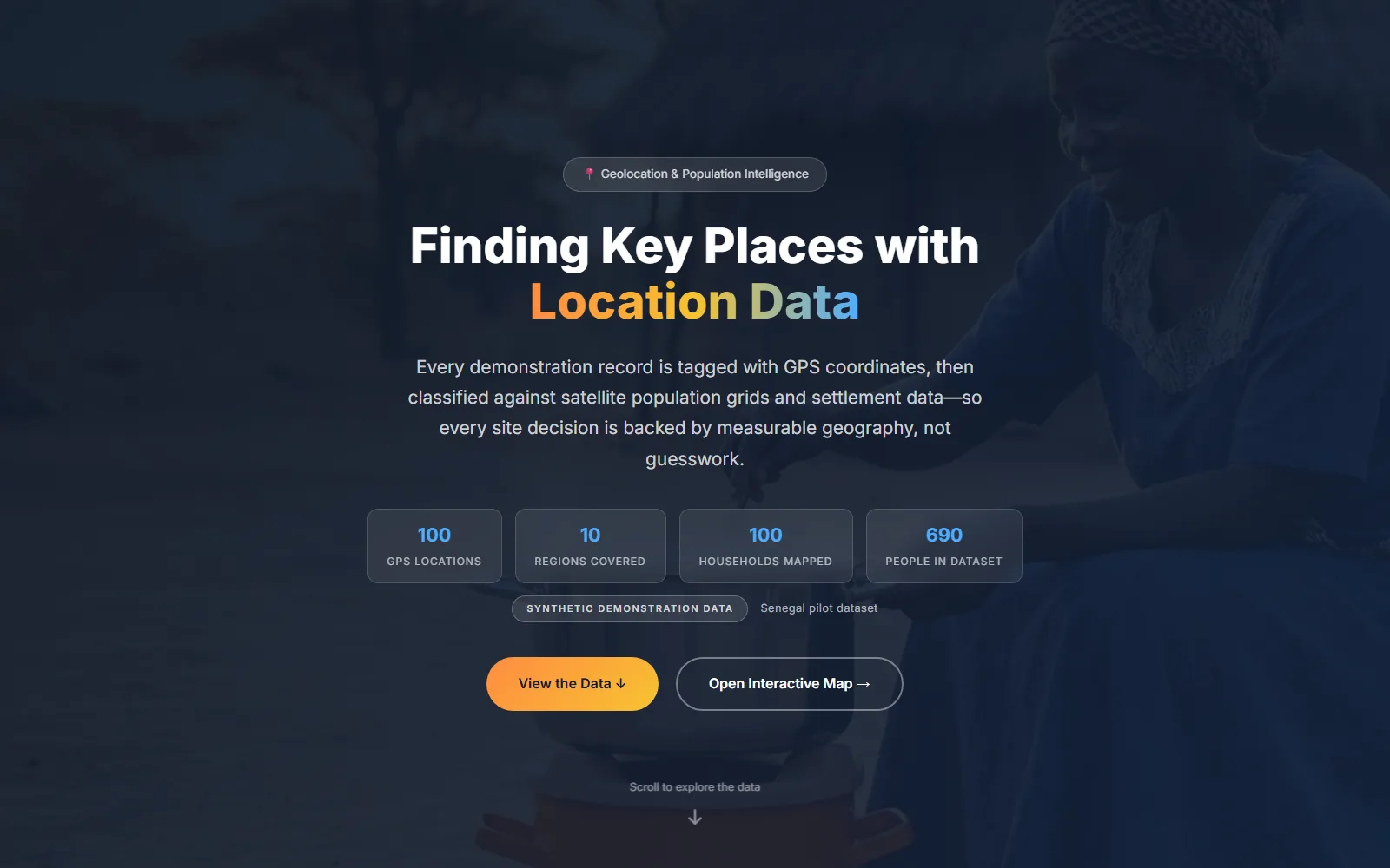
Location Impact Explorer landing page: Finding Key Places with Location Data
The brief

Rasters in, siting evidence out.

Clean-cooking programmes choose where stove installations go, and those choices are usually made against population numbers buried in scientific rasters — GHSL, Kontur, WorldPop — formats built for researchers, not programme officers. The gap between the data existing and the data deciding is where budgets misfire.

The Explorer’s premise: make open population data decision-useful. A build-time Python pipeline cuts the rasters into H3 Res-8 hexagons of roughly 0.74 km², tiers each cell on UN DEGURBA-aligned thresholds, and ships the result as a static bundle. The browser computes everything from that bundle on load: map, dashboard, statistics and registry, with no server anywhere in the path.

Every record on screen is generated — 100 synthetic households per country, 300 across Senegal, Mali and Cambodia — and every surface carries a “Synthetic demonstration data” badge. The honesty is part of the interface, not a footnote.

“The data is synthetic. The method is real.”
3
Countries · Senegal, Mali, Cambodia
300
Synthetic household records · 100 per country
0.74 km²
Per hexagon · H3 Res-8
0
Build steps on the product itself
100%
Of on-screen figures computed on load
The product

A map that argues in hexagons.

Deep navy, amber accents and a badge that never leaves the corner: the Explorer looks like an operations console because it is built like one — every layer traceable to a named open dataset, every figure derived in the open. A tour of what a user actually sees.

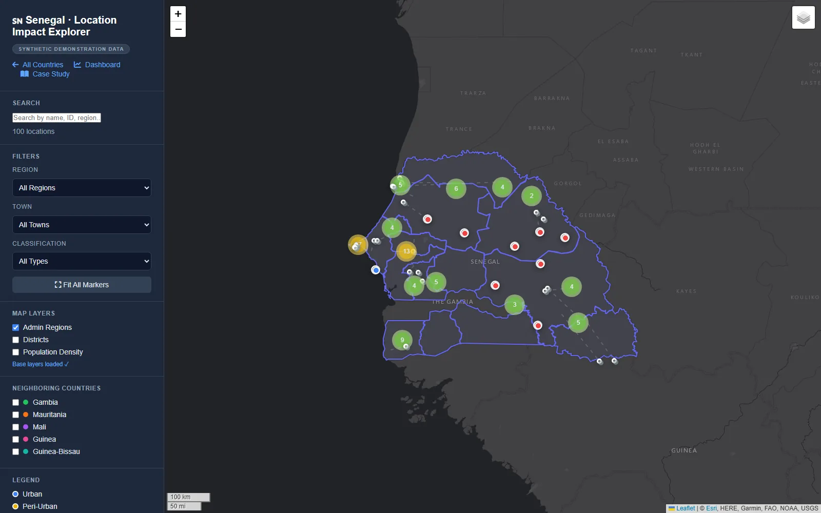
Senegal · interactive map
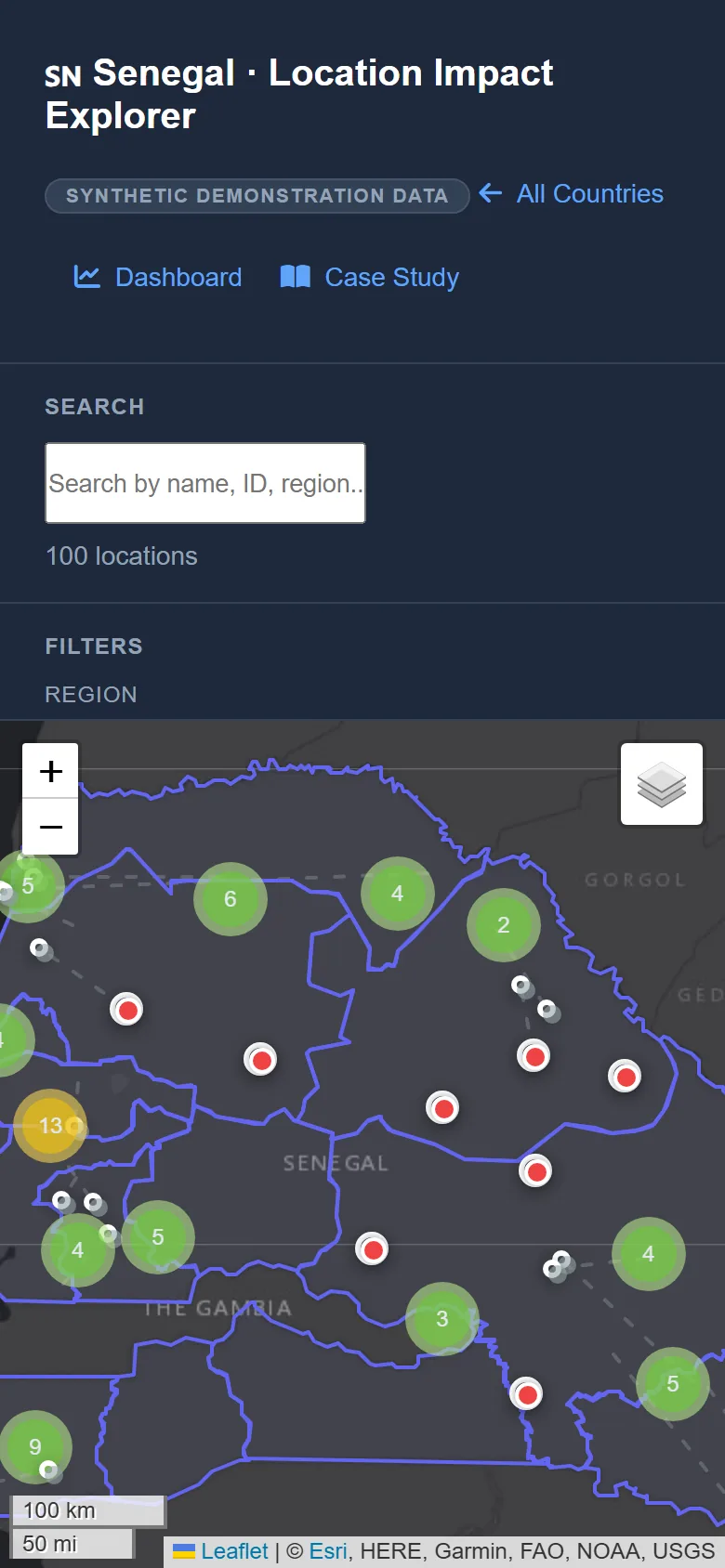
Interactive map of Senegal with clustered GPS markers, region filters and layer toggles
01 / The decision map

One country, one grid.

The Senegal view layers 100 GPS-located records over admin regions, with markercluster keeping dense areas legible and a legend separating Urban, Peri-Urban and Rural. Region, town and classification filters narrow the view; layer toggles switch admin regions, districts and population density; neighbouring-country switches keep context without clutter.
100 mapped locationsLeaflet 1.9 + markerclusterFilters, layers, legend
Dashboard · computed figures
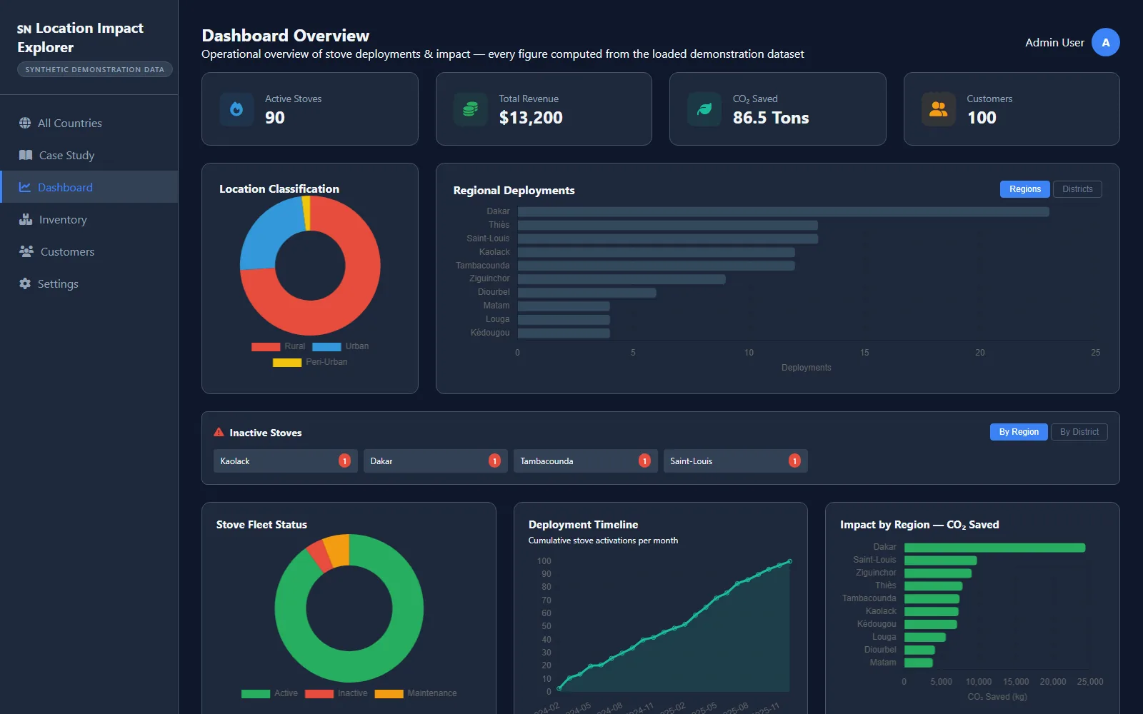
Operations dashboard with KPI cards, settlement classification donut and regional deployment charts
02 / Operations dashboard

The programme at a glance.

Active stoves, revenue, CO₂ saved and customer counts lead into a classification donut, regional deployment bars and a fleet-status breakdown. The dashboard's own subtitle states the contract: every figure computed from the loaded demonstration dataset — nothing pre-aggregated, nothing hardcoded, so the charts can never disagree with the map.

Chart.js 4Computed on loadOne shared dataset
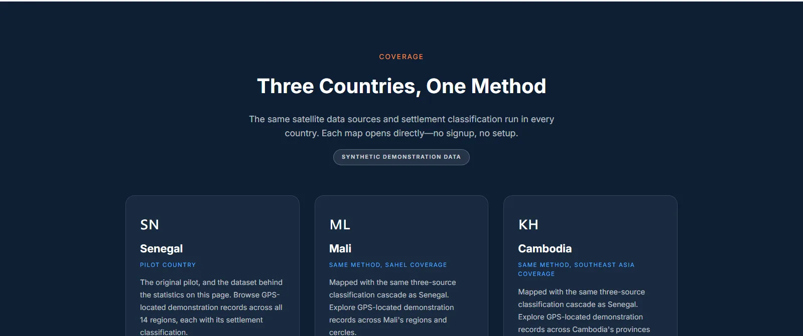
Coverage · SN / ML / KH
Coverage band presenting Senegal, Mali and Cambodia cards under a synthetic demonstration data badge
03 / The coverage band

Three countries, one method.

Senegal is the pilot country; Mali and Cambodia run the identical three-source classification cascade, scoped to regions and cercles or provinces. Each map opens directly — no signup, no setup — and the shared badge sits above all three, so what varies between cards is the data, never the tooling.

Senegal · Mali · CambodiaOne cascade, three outputsNo signup, no setup
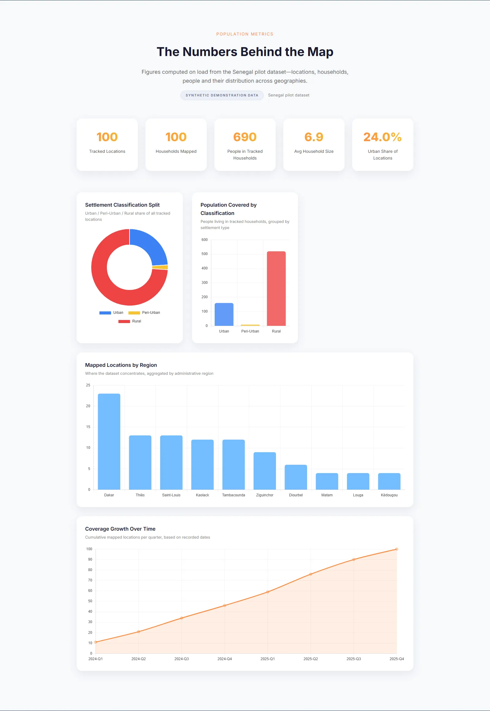
Statistics · numbers behind the map
Population metrics page: KPI cards, settlement classification donut and regional bar charts
04 / Population metrics

Numbers behind the map.

Tracked locations, households, people covered, average household size and urban share lead a statistics page where every figure is computed on load from the pilot dataset. The settlement split — Urban, Peri-Urban, Rural — comes straight from the classification cascade, and coverage growth plots cumulative locations per quarter from recorded dates.
Figures computed on loadDEGURBA-aligned tiersCoverage growth by quarter
Mobile · same static bundle
Mobile view of the interactive Location Impact Explorer map
05 / The same files, any screen

A map that survives a phone.

The demonstrator is plain HTML, CSS and JavaScript, so responsiveness is layout rather than an app: the sidebar collapses, map controls stay reachable and the synthetic-data badge stays visible. The same static files a laptop loads are exactly what a phone loads — there is no second build to drift out of step.
No app, no installOne static bundleBadge stays visible
Customer Registry · generated records
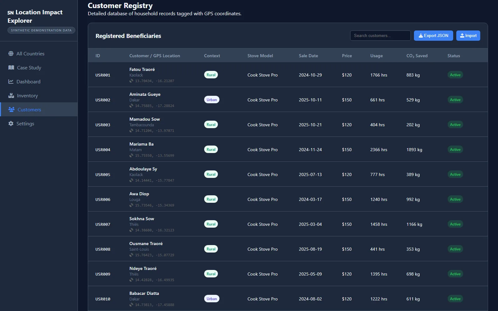
Customer registry table of synthetic household records with GPS coordinates, stove model and status
06 / The registry

Households as records.

A registry table lists each synthetic household — name, town, GPS coordinates, settlement context, stove model, dates, usage hours and CO₂ saved — with search, JSON export and import showing how a real programme's records would read. Every row is generated, and the badge in the sidebar says so before the first row loads.

GPS-tagged synthetic rows100 per countryExport / import built in
Under the surface

Method you can audit, not just admire.

The discipline a programme officer never notices but always benefits from: a fixed unit of analysis, traceable sources and honesty enforced in the interface rather than promised in documentation.

Hexagonal analysis cells

Population is analysed per H3 Res-8 hexagon of roughly 0.74 km², so “where” has a fixed unit and comparisons across regions and countries compare like with like.

H3 · Res-8

Priority-ordered sources

GHSL SMOD leads the classification, Kontur Population covers its gaps and WorldPop cross-checks the result. Sources are tried in order, never averaged, so every figure has one traceable origin.

SMOD → Kontur → WorldPop

Honesty as interface

A “Synthetic demonstration data” badge renders on every surface — landing, map, dashboard, statistics and registry — so no screenshot can pass for operational data.

Badge on every surface

Computed, never hardcoded

Every count, chart and percentage is derived in the browser from the static dataset on load. Change the data and every figure follows; there is no second place for numbers to live.

Client-side on load

Zero build step

The product is vanilla HTML, CSS and JavaScript with CDN-pinned Leaflet, Chart.js and Font Awesome. No bundler, no framework, nothing to rebuild — deploying means copying files.

Static files only

DEGURBA alignment

The three-tier classification follows the UN DEGURBA methodology’s logic, with thresholds stated in the product: above 1,000 people per hexagon is Urban, 300 to 1,000 Peri-Urban, below 300 Rural.

UN methodology, cited
The engineering

Rasters to records, at build time.

A build-time Python pipeline does the heavy lifting so the deployed product can stay static: sources resolved in priority order, cells classified on stated thresholds, households generated, bundle shipped. Nothing at runtime needs more than a browser.

01
Rasters in
GHSL SMOD · Kontur · WorldPop
Three open population sources feed the pipeline: the JRC’s SMOD settlement layer leads, Kontur Population fills coverage gaps, and WorldPop provides an independent cross-check of the classified result.
02
Hexagonal discretisation
H3 · Res-8 · ~0.74 km² cells
Continuous rasters are cut into a hexagonal grid so every settlement shares the same cell shape and area, and a decision about one region can be weighed against another without unit drift.
03
Classification cascade
DEGURBA-aligned thresholds
Each hexagon is tiered by population: above 1,000 people is Urban, 300 to 1,000 is Peri-Urban, below 300 is Rural. The thresholds ship inside the product, visible to the user rather than buried in a paper.▲ Thresholds stated, not implied
04
Synthetic households
100 records × 3 countries
A generator produces household records — name, town, GPS coordinates, stove model, dates, usage — so every interface has plausible rows to render. No real household is ever imported; the badge is earned at this stage.
05
Static bundle
Data as files · no API
The pipeline’s output ships as static files beside the HTML. There is no server, no database and no endpoint to secure: the demonstrator runs the same from a CDN as from a laptop.
06
Computed on load
Leaflet 1.9 · Chart.js 4 · browser
The browser is the pipeline’s last stage: KPIs, charts, map layers and the registry are all derived from the bundle on load, so the shipped files and the rendered page cannot drift apart.
pipeline/classify.py (the classification cascade)
# pipeline/classify.py - UN DEGURBA-aligned tiers, applied per H3 Res-8 hexagon
def classify(pop):
    if pop > 1000:
        return "Urban"        # dense settlement
    if pop >= 300:
        return "Peri-Urban"   # the transitional band
    return "Rural"            # sparse

# population sources are tried in priority order, never averaged:
# 1. GHSL SMOD (primary)   2. Kontur (fallback)   3. WorldPop (validation)
Open by construction
Every input is an open dataset and every library is open-source and CDN-pinned. No licensed data sits anywhere in the chain, so the whole method can be inspected end to end.
Synthetic, on purpose
Generated households let every surface be exercised honestly. The demonstrator never imports real records and never implies otherwise — the badge travels with the data.
Static by design
No server component exists in the product: files in, page out. What can be served from anywhere can also be read with view-source, which is the point.
The stack

Open where possible, static where it counts.

A geospatial stack with no server component anywhere in the runtime path: open rasters in, a static bundle out, and a browser does the rest.

Leaflet 1.9
Mapping
Interactive map engine, CDN-pinned, with markercluster for dense points.
Chart.js 4
Charts
Dashboard figures drawn from the dataset on load, never pre-aggregated.
H3 · Res-8
Grid system
Hexagonal analysis cells of roughly 0.74 km², identical across countries.
GHSL SMOD
Primary source
The JRC settlement layer that leads the classification cascade.
Kontur Population
Fallback source
Open population tiles used where SMOD has no coverage.
WorldPop
Validation
Independent raster used to cross-check classified hexagons.
Python
Build-time pipeline
Data preparation and synthetic-household generation, run before deployment.
Vanilla JS
Runtime
No framework, no bundler: HTML, CSS and JavaScript as static files.
Why it holds up

Honest by construction.

Labelled
The synthetic-data badge appears on every surface; nothing on screen can be mistaken for operational data.
Open
Open datasets in, open-source libraries out: GHSL, Kontur, WorldPop, Leaflet, Chart.js and H3, all inspectable.
Reproducible
The Python pipeline regenerates the data bundle from the source rasters, so the demonstrator can be rebuilt from scratch, not just redeployed.
Honest limits
It demonstrates a method, not operations: no live telemetry and no real households — and the product never claims otherwise.
A data demonstrator

Put your data on the map.

The Location Impact Explorer shows what open population data becomes when it is treated as an engineering problem: a fixed unit of analysis, a documented cascade and interfaces that say what they are. If your programme sits on data that deserves the same treatment, that conversation starts here.

Location Impact Explorer
Case study · Geospatial decision support · Built & sponsored by AI Boffin Hub
Like what you see

Want open data this decision-useful?

The Location Impact Explorer turns public rasters into a siting tool with an operations dashboard — and never pretends to be more than a demonstrator. If your programme needs the same honest engineering applied to its data, let's talk it through.

Fixed prices · Set against a written spec
Book a Production Consultation